4: Atmospheric Energy Budget
Key questions for this investigation
- What is the atmospheric energy budget and how does it shape variations in surface air temperature?
- What is happening with this budget have to produce the increasing annual global temperature that we are currently experiencing?
Tool used in this investigation
Build Your Own Earth < http://www.buildyourownearth.com > from University of Manchester
Background
Much of our discussion about climate change begins with temperature. The reason for this is rather simple, namely that surface air temperature is a consequence of the amount of heat energy in the lower atmosphere where we live. To understand what this means and how it relates to the climate changes we now seeing, it is useful to look at the earth’s atmospheric energy budget.
Simply put this budget is an accounting of how the energy that drives winds, ocean currents, the hydrological cycle, and other parts of earth’s climate system flows through the system. In its simplest form, shortwave electromagnetic radiation (visible light) from the sun strikes the earth at the top of the atmosphere. Approximately 30% of this energy is reflected back out into space, while nearly 70% is of this incoming radiation is absorbed by the atmosphere and converted into thermal energy (heat). Eventually this heat energy is radiated out into space in the form of long wave electromagnetic energy (infrared). The trick about the latter step is that some of this long wave radiation is absorbed by greenhouse gasses such as water vapor and carbon dioxide on its way out of the atmosphere. This means that these gasses heat the lower atmosphere to temperatures that are higher than they would be if greenhouse gasses were not present (see figure 1).
As long as the earth’s outgoing energy is roughly equal the incoming energy, average global surface temperature remains constant. However, if there is an imbalance then surface temperatures either fall (incoming is less than outgoing) or rise (incoming is greater than outgoing). The latter case describes our current predicament.
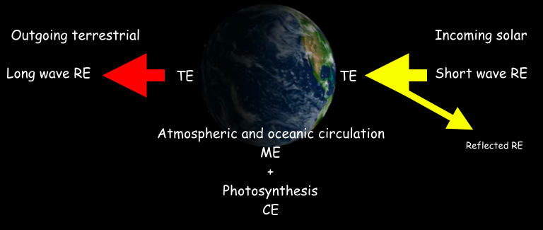 |
| Figure 1 – A simplified diagram of energy flow through the earth’s climate system
RE is radiant or electromagnetic energy which includes visible light, infrared, x-rays, microwaves, gamma rays, and radio waves. The incoming solar on the right is largely visible light – radiant energy having a short wavelength. Approximately 30% of this is reflected from clouds, particulates in the air, and light-colored land surfaces such as snow-covered slopes. The degree of reflectivity of a surface is referred to as its albedo. High albedo (highly reflective) surfaces include snow and cloud tops, while low albedo (low reflectivity) surface include dark ocean, asphalt roadways, and forests. TE is thermal energy (heat). In the case of the atmospheric energy budget, the incoming RE that is absorbed converted into heat. It is important to note that while temperature and heat are related, they are not the same thing. This is best understood by noting that different substances can possess the same thermal energy but have very different temperatures. The temperature response of a substance to the amount of thermal energy it possesses is called heat capacity. Water having a higher heat capacity than rock and soil is one of the reasons continents tend to be colder in the winter and warmer in the summer than ocean at the same latitude. ME is mechanical energy which in this case is moving air (winds) and water (ocean currents) ultimately driven by difference in surface temperature. More about this in the Atmosphere / Ocean Circulation activity later in this manual. CE is chemical energy produced by photosynthesis. Though only a small portion of the absorbed incoming RE is converted into CE by this process, photosynthesis is important in regulating carbon dioxide concentrations. A major determinant in surface air temperature. The outgoing terrestrial on the left is principally infrared radiation – radiant energy having a longer wavelength. In general, the higher the surface temperature of the earth, the “brighter it glows” in the infrared part of the electromagnetic spectrum. |
Investigation
Activity A – Investigating Surface Temperature
Launch Build your own Earth. When the title screen for the model appears click on “Getting Started”. This should give you a screen that looks like figure 2.
|
|
Figure 2: The startup screen for Build Your Own Earth. The principle control panels for the model are the two panels on the left side of the screen. The right side shows the energy per square meter received by the sun at the top of the atmosphere (solar constant), factors controlling the solar constant (obliquity, and eccentricity), and principle greenhouse gasses that influence the energy balance of the climate, hence air temperature at the surface.. |
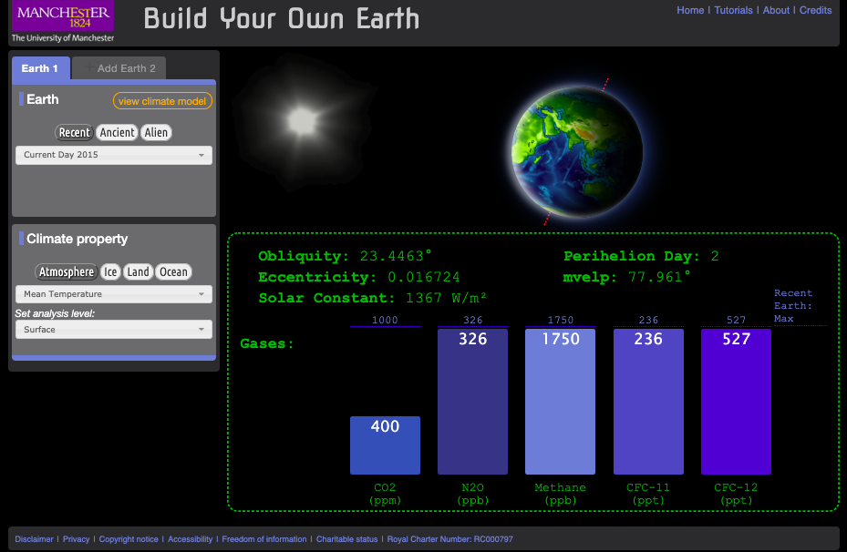
Begin by making sure that the “Earth 1” tab in the control panels on the right is highlighted blue and that the pull-down menu in the top panel (Earth) is set for “Current Day 2015”. In the lower panel (Climate Property) make sure that the “Atmosphere” button is dark grey and the pull-down menus under the button reads “Mean Temperature” and “Surface”. Then click on “view climate model” in the top panel. The screen that appears should look like figure 3.
|
|
Figure 3:Screen showing mean monthly surface air temperature for the entire planet. Like the previous screen the principle controls for the model are in the two panels on the left side of the screen. Additional controls include the timeline below the map legend which controls the month the map represents. The globe to left of the timeline changes the map projection. |
When the map first shows up it will automatically start scrolling through all the months of the year. Click the pause button on the left end of the timeline and then select January. Using this map answer the following questions…
- What is the range of temperature shown on the map?
- Where is temperature highest and where is it lowest? What are the values at each place?
- What do you notice about the temperature of the interior of the continents in the northern hemisphere compared to the temperature of the oceans at the same latitude? What part of figure 1 explains the observed difference?
Now set the timeline to July to answer the address the next three questions…
- Where are the temperatures highest and where are they lowest? What are the values at each place?
- How does the distribution of high and low temperatures change from January to July?
- How does the temperature of Northern Africa compare to that of the Atlantic Ocean at the same latitude? How does what you concluded in question 3 explain what you are see here.
Activity B – The Atmospheric Energy Budget and Surface Temperature
Now set the climate property in the left-hand control panel to “Top of the atmosphere”. If you are in the climate model mode, you should have a screen that look like figure 4.
|
|
Figure 4:Screen showing solar insolation at the top of the atmosphere for the entire planet. Like the previous screen the principle controls for the model are in the two panels on the left side of the screen. Additional controls include the timeline below the map legend which controls the month the map represents. The globe to left of the timeline changes the map projection. |
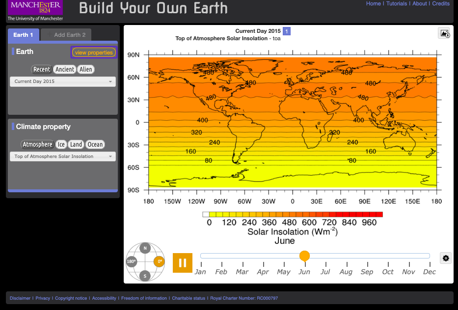
If the map is scrolling through the months, pause it and set the month for March. Using this map answer the following questions.
- What is the range of values shown on the map?
- Where is insolation the most intense and where is it the least? What are the values at each place?
- What is controlling the intensity of the insolation at each place? Remember that insolation is presented at energy per unit area (watts per square meter). Another hint is that March 21 is the spring equinox, which means that the sun is directly overhead at the equator at noon.
Now switch the date on the timeline to January.
- Where are the minimum and maximum insolations? What are the values at each place?
- Switch the date to July. Where are the minimum and maximum insolation now? What are the values at each place?
- How do the maps for January and July look different from that of March?
- What accounts for these differences?
Begin this next part by switching the date back to March and make sure that you have selected “Top of the Atmosphere” in the pull-down menu in the control panel. Create a second map by clicking on the “Add Earth 2” tab in the left-hand control panel. In the new Earth 2 panel select “Mean Temperature” in the control panel. After you have done this you should have a screen that looks like figure 5.
|
|
Figure 5:Screen showing both solar insolation at the top of the atmosphere (left side) and mean surface temperature (right side) for March for the entire planet. The blue dashed line in the middle of the map can be moved left and right to hide, show, and compare the maps. Click on hold on the pointer on the blue bar over the top of the map to do this. |
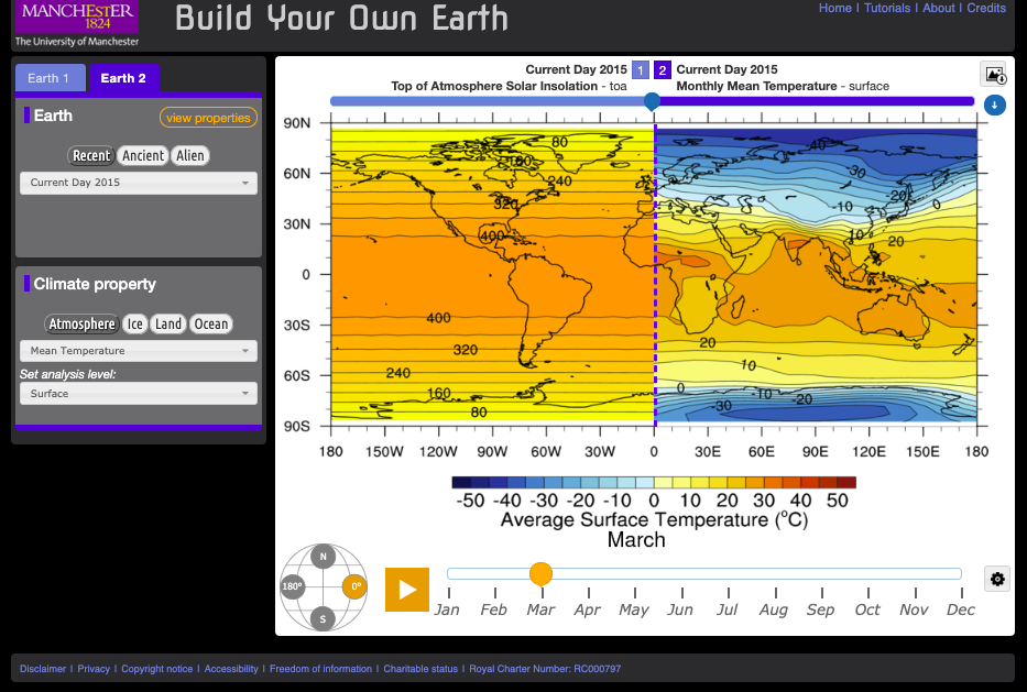
Using these two maps address the following questions
- In what ways are the two maps similar?
- In which ways are they different other than the fact they are displaying two entirely different variables?
- How does the insolation map explain what you see in the temperature map?
- What about the temperature map does the insolation map not explain?
- What other factors need to be taken into account to explain what the insolation map does not explain? Suggestion go the Earth 1 tab and try some of the other options in the “Climate Property” panel.
- With the model still in the dual map mode it’s time to investigate the energy out portion of the atmospheric energy budget. To set it up for this part of the activity set Earth 1 to “Current Day 2015” / “Atmosphere” / “Top of the Atmosphere Insolation” and set Earth 2 to “Current Day 2015” / “Atmosphere” / “Net Longwave Radiation” / “Top of the Atmosphere”. Pause the timeline and set it to March.
- What are the maximum and minimum values on the insolation and the long-wave radiation maps? Where are they?
- In ways are the two maps similar? In what ways are they different?
- What factors need to be taken into account to explain the differences?
Activity C – The Atmospheric Energy Budget and Changing Global Climate
Beginning with the same dual earth configuration you used at the end of Part B, set Earth 1 to “Current Day 2015” and “Mean Temperature” / “Surface”. Set Earth 2 to “No Greenhouse Gasses” and “Mean Temperature” / “Surface”. Pause the timeline and set it to March.
- How does the temperature map for Earth 1 (2015) compare to Earth 2 (no GHG)?
- How much of Earth 2 is habitable?
- Now set the climate property of both Earths to “Top of the Atmosphere Solar Insolation”. How do the two Earths compare?
- Next set the climate property of both Earths to “Net Long-wave Radiation” / “Top of the Atmosphere”. How do the two Earths compare?
- Now set Earth 1 to “CO2” / “Low” and “Earth 2” to “CO2” / “IPCC A1F1 CO2 Scenario, Year 2010”. Then set the climate properties for both Earths to “Mean Temperature” / “Surface”.
- What is the CO2 level in ppm (parts per million) for the Low and A1F1 scenarios? To find this out click on the “view properties menu” and toggle back and forth between Earth 1 and 2.
- How does the January and June surface temperatures of the Low scenario compare to the A1F1 scenario? To find this out you will need to click on the “view climate model” button unless you have already done so. Also in answering the question talk about what parts of the world show the most significant change and estimate what the temperature increase or decrease is.
Activity D – Synthesis
- In the BYOE model what factors control surface temperature?
- In some corners of society CO2 is referred to as a pollutant when talking about climate change, in others increased CO2 is promoted as a benefit to society. How do the results of activity C support and challenge both arguments?
