15: Regional Climate Impacts – IPCC WG1 2021 Report
Key questions for this investigation
- What climate impacts can be expected in the next 30 to 70 years?
- How do these impacts vary by region?
- What factors determine the frequency and magnitude of these impacts?
Tools used in this investigation
- IPCC WGI (Intergovernmental Panel on Climate Change – Working Group 1) Interactive Atlas
- AR6 Working Group Report 1 Report – Regional Fact Sheets
Background
The principal tool in this investigation, the Interactive Atlas, is a product of the 2021 IPCC working group, AR6 Volume 1: The Physical Science Basis. This document is the first of three reports that summarizes the science describing the present state of the earth’s climate system. These reports, collectively known as the Sixth Assessment Report (AR6), look at the current and probable extent of global climate change (volume 1), the impacts of and adaptation to this change (volume 2), and strategies for mitigating this change and its impacts (volume 3). Volume 1 was released in August 2021, while the other two volumes are scheduled to be finalized in February 2022 (volume 2) and March 2022 (volume 3).
 |
Figure 1 – Sixth Annual Report Volume 1 homepage as of 22 August 2021. The cluster of blue bars above the graphic at the bottom of this screenshot is a menu for downloading the report and regional fact sheets, and accessing the interactive atlas and various data sets. |
The atlas provides access to the data and projections contained in the report. Using a map interface, users can assess changes in a variety of climate variables and related impacts on a global, regional, or local scale. Key variables include annual and seasonal air and ocean temperatures, precipitation, snowfall, surface wind, air quality, sea ice concentration, surface seawater pH, and sea level. Users can investigate different possible outcomes by selecting the database, models, or model assumptions used for determining them. They can also examine these for selected future time periods – near, medium, and long term (2021-2040, 2041-2080, and 2081-2100, respectively), as well as different emissions scenarios.
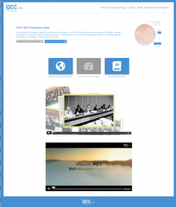 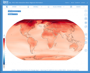 |
Figure 2 – Gateway page for the interactive atlas (left) and the regional information screen for the atlas (right). |
Investigation
This investigation begins by having you explore temperature and precipitation changes on a global level for several different emission scenarios. As it progresses you will look at additional climate impacts for progressively smaller areas for these same scenarios. In each of the three activities in this investigation you will use either the interactive active atlas or the regional fact sheets to answer a series of questions.
Activity A: Evaluating climate impacts – A global view
In this first activity you will be looking at regional changes in average annual temperature and precipitation for four climate scenarios. To begin, launch the Interactive Atlas < https://interactive-atlas.ipcc.ch/ >. What should appear when you do this should look like the following figure.
|
Figure 3 – Title screen for the Interactive Atlas
This page includes a brief description of the atlas, a globe in the upper right corner that you will be using for Activity A, links to a regional atlas and additional information about it. Summary information about the atlas and the IPCC report it is part of can be found in the two videos in the lower half of the page. |
The spinning globe in the upper right provides you with a qualitative perspective of the regional changes in temperature and precipitation under global warming scenarios varying from +1.5° to +4.0°C above pre industrial average annual temperatures. By default the globe shows regional temperature for a +2.0°C warmer world. Warming is shown in shades of red, while cooling is indicated by shades of blue. The darker the red the greater the warming. Likewise the darker the blue the greater the cooling.
Moving the cursor over the left side of the globe accesses information about these projections and the models used to construct them. Click and drag on the globe to rotate it. To the immediate right of the global is a list of warming scenarios (climate futures) you can choose from. Below that list are buttons that allow you to switch between regional temperatures and precipitation.
Like the temperature display, the precipitation display is qualitative. This means that there is no legend or overlays that tells you the magnitude of the changes shown. The general rule of thumb is that bluish-greens indicate areas that are wetter than the pre-industrial average, while white indicates little or no change, and orange shows areas that are drier than the pre-industrial average. Like temperature, the darker the color the more intense the change. The regional maps used for Activities B and C provide you with tools for doing quantitative analysis.
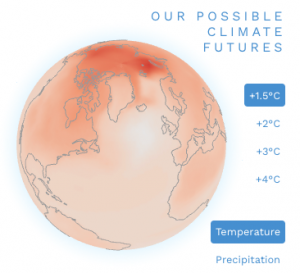 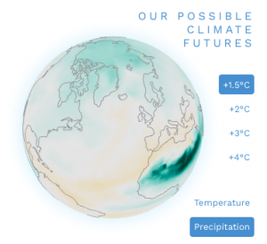 |
Figure 4
Title globe showing regional changes in temperature and precipitation for a 1.5°C increase in average annual global temperature. |
Beginning with the default view (Temperature in a +2.0°C world) answer the following questions.
- Where is the regional temperature change the highest? Where is it the lowest?
- How does the temperature change of the oceans compare to that of the continents?
- Are there any parts of the ocean which are an exception to the rule you stated in the previous question?
- Now switch to temperature in a +2.0°C world. In general is a +2 world wetter or drier than a pre-industrial one?
- Where in the world would it be wetter? Where would it be drier?
- Finally try out the other warming scenarios. How does the +1.5° compare to the +2°C world? How does the +3°C and +4°C compare to the +2.0°C world?
- In each case what areas show the largest impact?
Activity B: Evaluating climate impacts – A regional view
While the globe you used in the previous activity is useful for getting quick glimpses into regional changes in annual temperature and precipitation, it has no tools for numerically analyzing potential changes, assessing impacts other than temperature or precipitation, or looking at results from a variety of climate models and databases.
In this activity you will be using the regional information module in the interactive atlas. To access it click on the “Regional Information” button on the atlas gateway page (figure 5). What appears should look like the screenshot in figure 6.
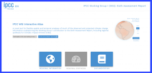 |
Figure 5 – Top half of the Interactive Atlas gateway page.
Click on the first blue button at the bottom of this view to access the regional information module. |
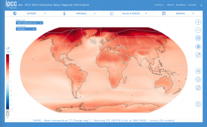 |
Figure 6 – Interactive Atlas regional information module.
This map is showing mean annual temperature change for a +2°C world. The controls at the top of the map enable you to change this information, the two blue bars in the upper left corner allow you to select regions you wish to analyze, and the icons on the right allow for more detailed and localized analysis. |
To begin familiarizing yourself with the atlas Interface, open the Region Set menu and answer the following questions.
- What options do you have for Region Set? This menu should have defaulted to WGI Reference-regions when you launched the atlas. If it did not select that option from the list.
- In a +2°C world which region shows the greatest change in average global temperature? Which shows the least change? To identify the region click on it. What you should see is a pop-up information panel that looks like figure 7. The region name is in the second line of the title – circled in red.
- What is the magnitude of the change? To find this click on “Table Summary” – circled in green in figure 7. What you should get should look like figure 8.
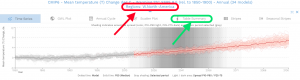 |
Figure 7 – Graph of regional mean annual temperature change in a +2°C world from 1850 to 2100.
The name of the region is circled in red. The control to access the table summary is circled in green. |
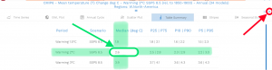 |
Figure 8 – Table summary of regional mean annual temperature change for four global warming scenarios (1.5 to 4°C).
The mean change for this region in a +2°C world is circled in green. The blue “x” circled in red clears this information panel revealing the entire map. Note don’t use this feature yet, you’ll need to continue using this panel to complete the following table (Table 1). |
Next find and open the “Variable” menu in the upper left portion of the frame. Select one of the other climate impact variables from the list and observe what happens to the map and the table. Note you will need to move your cursor away from the menu for it to disappear so you can see the change.
Using the “Variables” menu complete the following table (Table 1). Note – For the impacts listed in this table the changes are also shown for a +1.5°C, +3°C, and +4°C world. Also note – Because not all the impacts are relevant to the location you have selected, these should be marked as n/a (not applicable).
| Climate impact | +2°C | +4°C | +3°C | +1.5°C |
| Mean temperature change – Median (°C) | ||||
| Change in minimum temperature – Median (°C) | ||||
| Change in maximum temperature – Median (°C) | ||||
| Change in days with max temp > 40°C – Median (days) | ||||
| Change in number of frost days – Median (days) | ||||
| Total precipitation change – Median (%) | ||||
| Change in max 5 day precipitation amounts – Median (%) | ||||
| Consecutive dry days – Median (days) | ||||
| Change in snowfall – Median (mm/day) | ||||
| Surface wind change – Median (%) | ||||
| Sea surface temperature change – Median (°C) | ||||
| Ocean acidity – Change in surface pH – Median (pH) |
Activity C: Evaluating climate impacts – A “local” view
An additional aspect of the interactive atlas is the ability to look at climate impacts on a more local level. If you zoom in as close as you can the map begins to look like a patchwork quilt, each patch having a single color. These patches, referred to as cells, are a key component of the models used to produce the maps in this atlas.
Climate models are essentially sets of equations that simulate the flow of energy and matter throughout the earth’s climate system. This implies that the models are simulating mass / energy flows between points that are spaced equidistant apart. However, rather than points, climate models break the atmosphere and oceans up into stacks of equal sized cubes (cells) that mass and energy constantly flow out of and into. This means that what you are seeing through the magnifying glass in Figure 8 is the bottom of stacks of cells extending up to the top of the atmosphere.
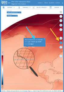 |
Figure 9 – Screenshot of the atlas in the “Point Information” mode.
|
Due to limitations in available data and the processing power of computers used to run climate models there are limits to how small these cells can be. In the case of the interactive atlas the cell size is on the order of 2500 to 10,000 square kilometers. This means that the value of any climate variable being displayed is the same no matter where you are inside a cell.
A tool for determining the value of each cell is the “Point information” mode. To turn on this mode click on the icon indicated by the yellow arrow in figure 8. Once this mode is active you can click anywhere on the map to see the value of that point. So rather than seeing statistics for an entire region you can drill down to a much smaller, more local area. Just like you did in the previous activity, you can change the climate impact being displayed using the “Variable” menu. There are two cautions to keep in mind when you do this, however.
- First, whenever you change the variable displayed the information panel that pops up whenever you click on a point disappears. So you need to remember the longitude and latitude of the point you clicked on so you can find it again on the new map.
- Second, these cells cover large areas, so you need to remember that when you look at climate impacts for a city or town, what you get is highly generalized.
Equipped with this information, select a specific place (e.g. the city you live in, a rural area some of your food comes from, a favorite vacation spot) and complete the first two columns of the following table. Note – You will need the longitude and latitude of that place.
| Climate impact | +2°C | +4°C | +3°C | +1.5°C |
| Mean temperature change – Median (°C) | ||||
| Change in minimum temperature – Median (°C) | ||||
| Change in maximum temperature – Median (°C) | ||||
| Change in days with max temp > 40°C – Median (days) | ||||
| Change in number of frost days – Median (days) | ||||
| Total precipitation change – Median (%) | ||||
| Change in max 5 day precipitation amounts – Median (%) | ||||
| Consecutive dry days – Media (days) | ||||
| Change in snowfall – Median (mm/day) | ||||
| Surface wind change – Median (%) | ||||
| Sea surface temperature change – Median (°C) | ||||
| Ocean acidity – Change in surface pH – Median (pH) |
Unlike that information panel that pops up in Activity B when you click on a region, the panel that appears when you select a place in the “Point information” mode only says what the climate variable you are looking at would be in a +2°C world. To complete table 2 for a +1.5°C, +3°C, and +4°C world you need to change the map itself. To do this select the variable you are interested in from the “Variables” menu and then open the “Value and Period” menu. Select either a +1.5°, +3°, or 4°C warming from the first column in the menu. Then repeat what you did in the first part of this activity for the degree of warming you just selected. Record this information in the appropriate column in table 2.
Activity D: “Improving the odds”
By default the interactive atlas shows climate impacts between now and the year 2100 assuming an emissions scenario dubbed SSP5 8.5. An emissions scenario is a set of assumptions used to construct a climate model that is based on the amount of greenhouse gases being emitted into and removed from (sequestration) the atmosphere by human activity. An SSP5 8.5 scenario is one in which fossil fuel extraction and use continues to expand and little if anything is done to sequester the GHGs being emitted.
At the opposite end of the spectrum is the SSP1 1.9 scenario. This is IPCC’s most optimistic scenario where global CO2 emissions are cut to net zero by 2050. To accomplish this societies switch to low / no carbon energy sources, increase energy and resource efficiency significantly, and improve forestry and agricultural with an emphasis on sequestering rather than emitting carbon. Because this is regarded as an extremely optimistic scenario, it has not been included in the Atlas. Instead it begins with SSP1-2.6, a less ambitious, and thereby plausible scenario.
The control for which emissions scenario you are looking at is found in the middle column of the “Value & Period” menu. That list actually begins with a slightly less ambitious proposal (SSP1 2.6). In this scenario GHG emissions are cut severely but not as fast, net zero being achieved after 2050. Also like SSP1 1.9, there is the same emphasis on low / no carbon energy sources, energy and resource efficiency, and sequestration via improved forestry and agricultural practices.
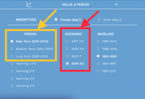 |
Figure 10 – Value & Period menu
The items in the red box are options for emission scenarios. The items in the yellow box are the periods that the climate impacts are shown for based on the selected emissions scenario. |
The first column in the menu (outlined in yellow in Figure 10) is the period of observation given the selected emissions scenario. For instance, if we wanted to get a sense of what the year 2050 might look like under a high emissions scenario you would want to select SSP5 8.5 from the center column and “Medium Term (2041 to 2060) from the first.
Begin this activity using the same place you selected in the previous activity. Now using both the “Variable” and “Value & Period” menus complete the following table (table 3) for that place.
| Climate impact | Near term | Long term | ||
| SSP1-2.6 | SSP5-8.5 | SSP1-2.6 | SSP5-8.5 | |
| Mean temperature change – Median (°C) | ||||
| Change in minimum temperature – Median (°C) | ||||
| Change in maximum temperature – Median (°C) | ||||
| Change in days with max temp > 40°C – Median (days) | ||||
| Change in number of frost days – Median (days) | ||||
| Total precipitation change – Median (%) | ||||
| Change in max 5 day precipitation amounts – Median (%) | ||||
| Consecutive dry days – Media (days) | ||||
| Change in snowfall – Median (mm/day) | ||||
| Surface wind change – Median (%) | ||||
| Sea surface temperature change – Median (°C) | ||||
| Ocean acidity – Change in surface pH – Median (pH) | ||||
