16: Assessing Change with the Climate Impact Map
Key questions of this investigation
- What is normal temperature for your area based on current averages?
- How might the temperature of your area change in the next 20, 30, and 70 years?
- How might different development scenarios impact the rate of this change?
Tool used for this investigation
- Climate Impact Map – Impact Lab < http://www.impactlab.org/map >
Background
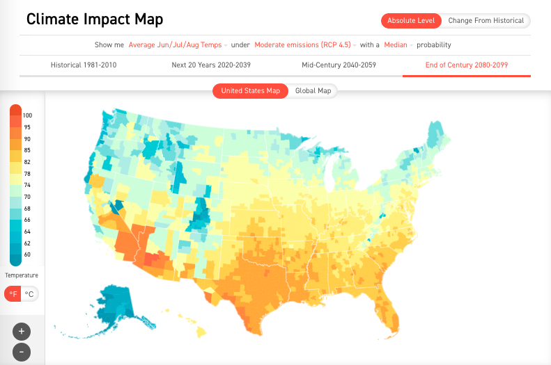
The Climate Impact Map is an online interactive map showing potential changes in regional temperature through the year 2100. The viewer shows forecasted temperature based on different development scenarios. It displays both temperature and change in temperature from historical average for individual states within the United States and entire countries outside the US. The time periods displayed included historical averages (1981-2010), the next 20 years (2020-2039), mid-century (2040-2059), and the end of the century (2080-2099). You control the development scenario, hence the degree of temperature change, by selecting the potential greenhouse gas concentration for each time period.
Investigation
Activity A – Determining what’s normal for your area
Launch the Climate Impact Map < http://www.impactlab.org/map>. The map that appears when you do this will show the historical average summer temperature by county for each state in United States. Historical average is defined as the period 1981-2010 and summer is defined as June, July, and August.
A color scale to the left of the map can be used to estimate the temperature in either °F or °C. Clicking on the state of interest displays the average for the entire state.
|
|
Figure 1Default screen for the climate impact map. Most of the controls for the viewer are in the banner at the top of the map. |
To begin looking at what is normal for your area make sure that “Historical 1981-2010”, and “United Stated Map” are highlighted in red. Also click on “Average June/Jul/Aug Temps” to access a pull-down menu and select “Average Annual Temps” from that list. When you are finished the banner across the top of the map should look like this…
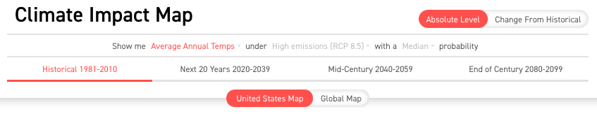 |
Figure 2 – Banner settings to start activity A. Where you should be to address question 1. |
Current climate – Questions
- What is average annual temperature (in both °F and °C) of the state you are in? Click on the state to find this. Use the controller under the color bar to the left of the map to switch between °F and °C.
- What is the average summer temperature of the state? To find this click on “Average Annual Temps” and select “Average Jun/Jul/Aug Temps” from the pull down menu that appears (the “Show me” menu).
- What is the average winter temperature of the state? Select “Average Dec/Jan/Feb Temps” from the “Show me” menu.
- What is the average number of days where average daily temperature is below freezing? For this select “# Days < 32°F / 0°C”.
- What is the average number of days rated as extreme heat events? For this select “# Days > 95°F / 35°C”.
Activity B – Projected temperature change
For this activity reset the viewer to display the average annual temperature for 1981-2010. In other words, reset everything so the control banner looks like figure 2. To begin looking at forecasted temperatures select one of the other time periods in the banner such as “Next 20 Years 2020-2039”. You will be using this facet of the viewer to investigate the following question.
Projected changes – Questions
- What is the average annual temperature of your state during 2020-2039, 2040-2059, and 2080-2099?
- What is the average summer temperature in each period?
- What is the average winter temperature in each period?
- How much did the annual, summer, and winter temperatures increase in each period? The increase being the difference between the period temperatures and the average for the historical period.
- What is the number of days of temperature below freezing for each period?
- What is the number of days rated as extreme heat events for each period?
- How might the number of freezing days and extreme heat events change in each period relative to 1981-2010? Make sure to use numbers to back up your conclusions.
Activity C – Impact of projected temperature change
In this final activity you will be examining how what we collectively choose to do could impact future temperatures. To begin again reset the viewer to display average annual temperature for 1981-2010 (figure 2). This time note the phrase “High Emissions (RCP 8.5)”. RCP stands for Representative Concentration Pathway 8.5. This is a term used by the Intergovernmental Panel on Climate Change (IPCC) to describe a world in which there are high concentrations of greenhouse gasses (largely CO2) brought on by expanded use of fossil fuels with little or no carbon mitigation, continued deforestation, and other human activities releasing large quantities of GHGs into the atmosphere. By default this is the pathway that appears in the viewer because this is the pathway we have historically been on. It is also grayed out, meaning it is an inactive control as long as we are looking at historical data.
To change the RCP select one of the other time periods (e.g. 2020-2039). When you do this RCP 8.5 will be highlighted in red. Click on it and you will see a pull-down menu (the under menu) with two other options – “Low emissions (RCP 2.6)” and “Moderate emissions (RCP 8.5)”. The RCP 2.6 scenario is one in which net carbon emissions from global human society has been reduced to zero by switching to a strong dependence on renewable energy sources, reduction of per capita resource consumption, and large-scale carbon sequestration. RCP 4.5 is essentially a midpoint between the low and high emission scenarios in which dependence on fossil fuels has been decreased but not eliminated and there is a modest movement toward reducing per capita resource consumption and carbon sequestration.
The impact of RCP on climate – Questions
- What is the average annual, winter, and spring temperatures of your state at the end of the century under the low, moderate, and high emission scenarios?
- How much might each of these averages change under each scenario? To answer this question, you are comparing historical averages to the end of the century.
- How do these scenarios compare in terms of changes in the number of freezing days and extreme heat events between 1981-2010 and the end of the century?
