8: Today’s weather – Temperature
Key questions for this investigation
- What does the earth’s air and ocean temperature for today look like?
- How do those temperatures compare to what is “normal”?
Tool used in this investigation
- Climate Reanalyzer – Climate Change Institute / University of Maine < https://climatereanalyzer.org/ >
Background
A key part of human existence is that we live in “climate bubbles”. In other words, many of us tend to view what is happening with the earth’s climate as a whole on the basis of today’s, this month’s, or this year’s weather in the place where we live. Furthermore, since air temperature is something fairly tangible that affects our level of comfort, it is not uncommon to accept or reject claims that the earth climate is warming on the basis of what is happening within our bubbles. This set of activities is designed to examine the validity of that practice by comparing the current weather for where we live to daily climate statistics for that and other places around the world.
To accomplish this, you will be looking at several averages of the temperature in your area and comparing this to the same statistics for other places in the world. You will also be doing this for sea surface temperature. The reason for looking at ocean temperature will be explained later in this background section.
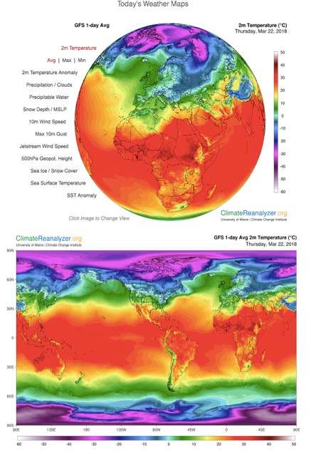
The first average you will be looking at is a daily average for any given spot on the earth’s surface. This is quite simply the mean of all the temperature readings for the day for a specified place. When you select the 2 m average temperature map from the “Today’s Weather” menu of Climate Reanalyzer, this is what you are seeing. The 2 m indicates the altitude of the air measurement, namely 2 meters above the earth’s surface.
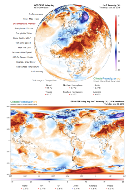
The second statistic is the daily mean air temperature for a given date averaged over a 30- or 50-year period. In other words, to determine the “normal” temperature for January 15 at any one place we average all the daily average temperatures for that date at that place over a 30- or 50-year period. While Climate Reanalyzer does not display this average, it does display another statistic derived from it, the 2 m temperature anomaly. This anomaly is the difference between the long-term normal daily average for a given date and place and the daily average for that place measured on that date during any one year. In the Climate Reanalyzer temperature anomaly map, areas where the average temperature for a given date are above the long-term average for that date appear in shades of red, areas where temperatures are below normal appear in shades of blue, and areas where the temperature are at or close to normal are white.
In the second activity in this set, you will be looking at sea surface temperature (SST). This is because much of the heat energy in the earth’s climate system resides in the oceans. Because energy exchanges between the atmosphere and ocean are important determinants of surface air temperature, looking at trends in SST is important to understanding how and why surface air temperature changes as it does. In later activity sets we will be looking how these exchanges work and how they impact the larger climate system.
Investigation
Activity A: Ground level air temperature
|
Figure 1: Climate Reanalyzer map of daily average surface air temperature. |
To begin Part A, type < https://climatereanalyzer.org > into the address bar of your web browser. What you should see will look like the figure to the right (figure 1). Now select “Today’s Weather Maps” from the menu on the left side of the globe. By default, this displays the average air surface temperature for the entire globe for today. Be careful about moving the cursor over the list. Doing so can unintentionally change the data being displayed on the globe. To see the rest of the planet, click on the globe (this rotates it) or scroll the page down for a flat map of the world. Questions to investigate with this map
|
|
Figure 2: Climate Reanalyzer map of surface air temperature anomaly. |
Next, select the 2 m Temperature Anomaly from the menu to the left of the globe. This displays the variation from the 1979-2000 average of the daily temperature for the current date. This should look like figure 2. Variations from normal for the world, the Northern and Southern hemispheres, tropics, Arctic, and Antarctic are shown under both the globe and the flat map. Questions to investigate with this map
|
Activity B – Sea surface temperature
|
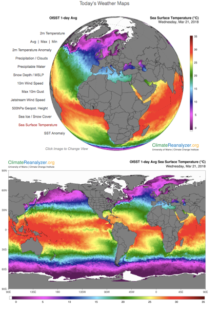
Figure 3: Climate Reanalyzer map of sea surface temperature. |
Select sea surface temperature from the menu to the left of the globe. This displays today’s sea surface temperature (SST) for the entire planet (figure 3) How the data used to construct this map was derived is explained in the narrative below the map. Questions to investigate with this map
|
|
Figure 4: Climate Reanalyzer map of sea surface anomaly. |
Select SST Anomaly from the menu to the left of the globe. This displays the difference between today’s average sea surface temperature (SST) and the average SST for this same date from 1971 to 2000 (figure 4). SST anomalies for the world, both hemispheres, and the oceans are listed below both the globe and the map. Questions to investigate with this map:
|